

Simplify experience for more than 30,000 bankers at CE Bank.
Caisse d’Épargne is one of the largest banking institutions in France (similar to Wells and Fargo), and part of the BPCE group. Every day, over 30,000 employees rely on its internal tools to serve millions of clients across the country.
The company faced a growing need to simplify internal workflows and boost operational efficiency, while also laying the foundation for a more user-centered approach across its digital ecosystem.
Challenge overview
Early discovery work revealed major friction:
🚫 Years of feature additions without UX vision led to a fragmented interface and inconsistent workflows.
🚫 Core screens lacked coherence and usability, making even simple tasks time-consuming.
🚫 Technical issues (slowdowns, bugs, and instability) started overloading the IT support team.

As a Lead Product Designer, I led the redesign of “My Day,” the key internal tool used daily by bankers, driving a clearer, more intuitive experience.
I defined and scaled a unified UX vision across dozens of parallel initiatives, contributed to the group-wide design system, and helped foster a stronger design culture across teams.
Outcome
30,000+ bankers onboarded
+25% productivity
(measured by task completion)
+ Faster onboarding for new employees
Step 0: Start with real users
I firmly believe that to solve human problems, I must begin with humans themselves by engaging directly with real users. In this project, it seemed only natural, especially considering that these users are readily accessible colleagues.

I met with a panel consisting of several user, customer service representatives, business managers and bank managers, all users of the tool every day.
My task was to understand their issues:
Why did they consistently have to call the technical support?
Why were they slowed down in their work?
What were their working conditions and environment?
why?...

Key deliverable:
I prepared the interview guide protocol, which has been validated by the team and serves as our roadmap, encompassing an overview of our objectives, a list of essential questions, and a detailed description of all the stages of the user journey.


The crucial step after gathering a wealth of qualitative feedback was prioritizing insights to align our vision and understanding of the target. It's also important to recognize that we can't address every issue simultaneously.
Step 1: Aligning Perspectives
With the support of the project's Product Owner, I facilitated a series of UX workshops and working meetings involving the core team and related departments such as data and technical teams to understand issues.
During these pivotal activities, each member of the product team reconciled their knowledge with reality. These workshops also provided the opportunity to:
Meet experts (Data, Customer Satisfaction, Business Analysts)
Merge existing qualitative and quantitative studies with data analytics to form convictions.
Understand the structure of the existing platform and grasp the technical issues associated with it.
Validate by Legal, Compliance, and Regulatory professionals


Interesting findings:
Manage too many applications, too many windows open on the navigator
Regular system crashes
Loading times were too long
A very high level of cognitive load and a lot of fatigue.
No or little technical support to resolve situations
Too many entries
Launching some processes from the command line
Step 2: Crafting Innovative Solutions
The creative part, my playground 😍
I continued to lead working sessions and meetings with the team to brainstorm creative solutions to these problems.
Have teams work on the solution based on user problems. Generally I combine activities inspired by certain phases of the Design Sprint such as "How might we", "crazy8" and "dot voting". I even brought Lego bricks already.
I adapt to the team. I try to make this moment playful and fun. It is a moment of relaxed expression, for everyone, so that anyone who wishes can offer their vision of the solution.
We had started to represent the ideal experience, identified the contribution of novelty and value for the user while taking into account the strong technical constraints. The structure was starting to fall into place.
Key ideas:
A list of pending tasks
Client callbacks reminders
Customer account status
(see results at the end)
Step 3: Mapping the Complex Ecosystem
To frame technical feasibility and viability of our assumptions, I set multiple workshop sessions with the information architects and lead development units. The goal was to draw, on a whiteboard, the path of users through the complex ecosystem. this map help us to shape the vision and to understand how the system would work and what systems/technology would be leveraged in the experience.


The flowchart has helped the technical teams to visualize and structure the tool. Navigation and information architecture began to take shape. Developers were able to make progress on their side with the platform's structure.
Step 4: From Concept to Creation
I always start sketching on paper or on the whiteboard, with the team, before moving onto the computer. This allows me to quickly move or modify areas.
Given that users are impatient and highly demanding, I focused on integrating real content into my prototype as early as possible to test an immersive prototype that closely resembles reality. I aimed to avoid unnecessary discussions and stay focused on the essentials. Based on the validations obtained and positive feedback, I delivered refined elements to the front-end developers throughout the testing process.
Key deliverable:
I designed an interactive prototype using Figma, focusing on the primary user journey of the platform. This particular journey was selected strategically due to its significant productivity impact, enabling us to validate our assumptions and collect essential feedback.
Step 5: Usability and Value Testing
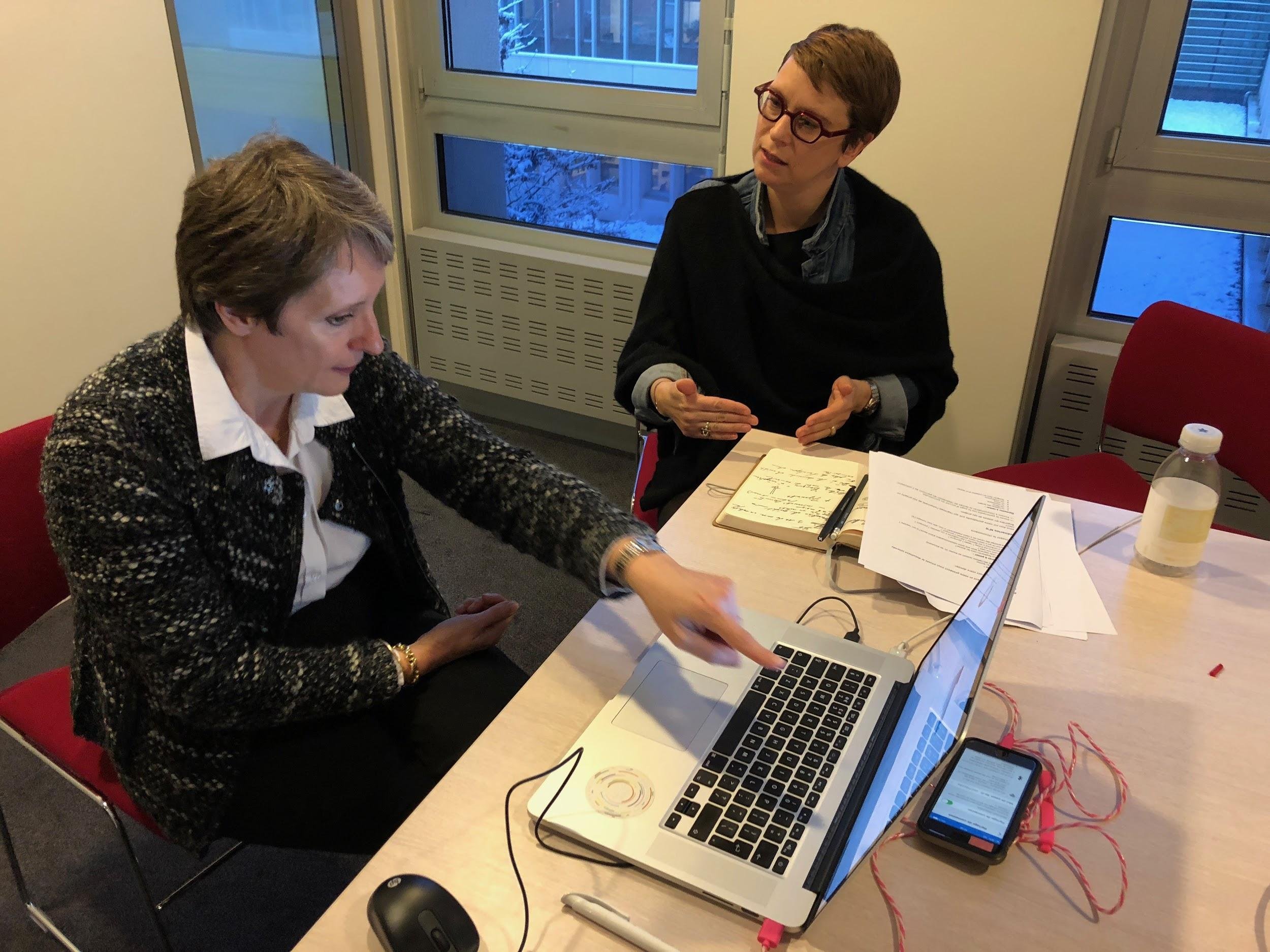
A Team work!
It took us a few weeks to test prototype on a panel of 54 employees to uncover glaring frictions and areas that had to be improved.

The feedback was very insightful. There were numerous suggestions for improving the MLP (Minimum Lovable Product). We couldn't address all the feedback; choices had to be made.

I facilitated a prioritization workshop based on factors such as frequency, impact on user experience, alignment with objectives, and potential business value.
Backstage: Create the design library
I created and maintained a growing library for the collaborators tools, a branch from the main Design System
To streamline processes and ensure consistency across all screens within the Design team, I collaborated with the development team to establish a dedicated 'Design System' branch. This involved implementing an automated process wherein each designer could propose potential components through a backlog, which was regularly prioritized to manage workload efficiently.

Final UI: Anatomy of the Pages

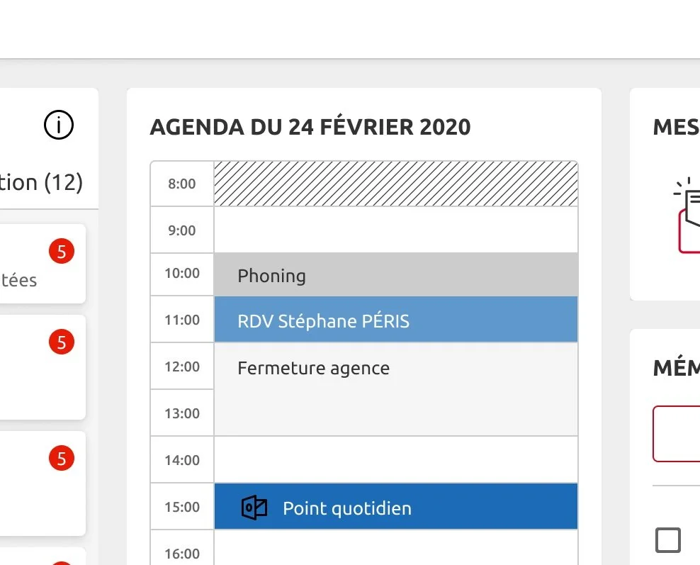
👌 A list of pending tasks
In the rhythm of daily operations, users encounter a neatly arranged set of activities through the "My Day" feature. It's like having a personal assistant curate your agenda each morning (risks, opportunities, alerts and pending actions).
This feature not only provides clarity but also offers a simple way to track productivity.

👌 Client callbacks reminders
To enhance customer relations, users have access to widgets to assist them in managing their time effectively and ensuring that no tasks are overlooked. Addressing customer inquiries and complaints, and taking care of clients to increase satisfaction, are paramount.
Additionally, it becomes easier to measure both user engagement and satisfaction levels.

👌 Customer account status
All customer accounts, both for businesses and individuals, are readily accessible, along with their associated equipment, metrics, and ongoing transactions. This includes a comprehensive list of subscribed insurances, savings plans, and services.
These data serve as invaluable support for swift decision-making and facilitate the identification of new business opportunities.
