

Redesigned PayPal websites for over 115 countries.
As one of the leading online payment service companies globally, PayPal stands at the forefront of facilitating transactions across 115 countries spanning Europe, the Middle East, and Africa.
The managing team identified this as a critical performance issue, requiring an immediate and effective resolution.
Challenge overview
🚫 The PayPal for Business website was underperforming, conversion rates were below expectations and key pages showed a high bounce rate.
🚫 There was no UX direction in place and no designer assigned, leading to disjointed experiences for merchants.
🚫 The site lacked consistency with PayPal’s broader brand and marketing strategy, creating a disconnect for users across channels.

As a UX director at Rapp, I led the redesign of the PayPal for Business experience to better serve merchant users.
I defined a clear UX vision, aligned stakeholders across design, product, and marketing, and built a streamlined user journey grounded in UX methodology.
My work combined UX strategy, content architecture, and rapid prototyping, with a strong focus on conversion, clarity, and consistency.
I also helped shape a scalable design foundation to support future iterations.
Outcome
+13% increase in conversions across key merchant journeys after launch.
Bounce rate dropped by 18% on high-traffic pages like pricing and onboarding.
Stronger alignment with PayPal’s new guidelines, improving user trust and perception.
Step 1: Diagnosing Site Performance Issues
After questioning stakeholders to understand how they were meeting their users' needs, I realized that the user was being overlooked :
The user is absent in discussions about tools
No precise understanding of these needs
insufficient data analysis performed
A strategic decision was made by EAMA leaders to heavily prioritize business users, a significant revenue source with the most identified issues.

🗝️ Deliverable:
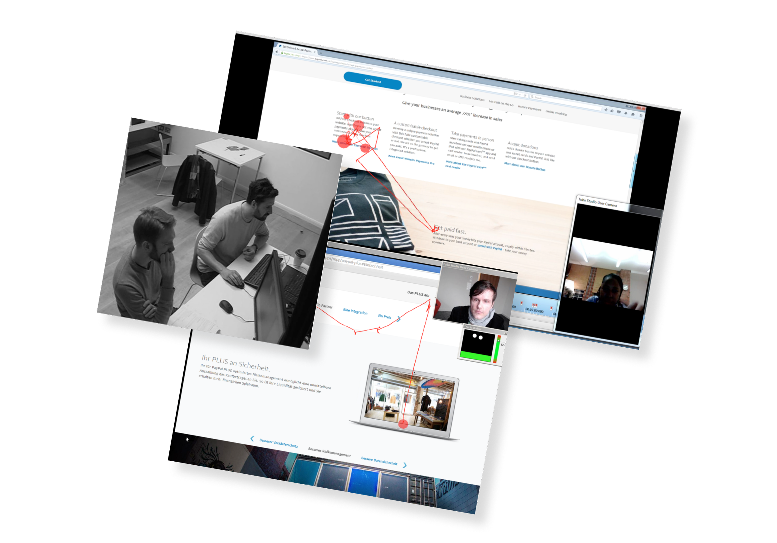
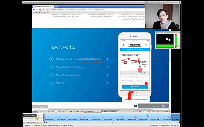
I prepared the interview guide protocol, which has been validated by the team and serves as our roadmap, encompassing an overview of our objectives, a list of essential questions, and a detailed description of all the stages of the user journey.

I led the team to start from scratch by directly asking merchant users (those with the highest financial stakes) for their opinions on the online platform.
Therefore, I proposed conducting a study on a panel of 30 users spread across 3 strategic regions (France, United Kingdom and Germany).

Key Results of the analysis
All the prospective users we contacted knew about PayPal, and they had created a free account with Ebay as part of their subscription.
Many major issues emerged:
In term of usability and architecture, users couldn't find their way around, the navigation was confusing and haphazard, and the title of menu items was unclear.
Content-wise, they were unable to understand the benefits of the products in relation to their needs, used a lot of jargon, and didn't have enough answers to their questions.
Based on ergonomics, there were no actions or CTAs on the product pages.
As a result, no users considered using PayPal solutions for their businesses.

🗝️ Deliverable:
After conducting interviews, I synthesized the responses, feedback, and behaviors into 4 meta-personas. These personas are essential guides that require ongoing nourishment and refinement throughout the platform's lifecycle, serving as foundational pillars.
They served as invaluable tools and a launching pad for further reflection.
Step 2: Face the problems
We had to move fast and focus on the solution. A Design Sprint was the best method for involving people and creating a valuable prototype.
I organized a custom 3-day Strategic Design Sprint to frame the brand new platform proposal with the help of the product team from Palo Alto, who came to lend a hand and ensure alignment.

We focused our efforts on framing the Website Payments Standard journey, which stands as the most strategic and revenue-generating product pathway for the company.


🗝️ Deliverable:
A rough collaborative paper prototype was sketched out for the main homepage, sub-homepages, and the product page with additional UX guidelines and content:
Tailor content based on geographic location to personalize the user experience.
Reduce bounce rates on marketing websites and enhance lead conversion through a streamlined and concise user journey.
Effectively demonstrate the value of the products
Enhancing the Sense of Security on the Website
Special emphasis was placed on fine-tuning the subscription and contact funnels.
Step 3: A Journey Towards Solutions
Following the stakeholders' updated business directives informed by insights into user needs,

I orchestrated a series of ideation and creative workshops revolving around the user journey, fostering collaboration and innovation among team members.

Using post-its as our starting point, we built layer upon layer collaboratively with the core product team, culminating in final screens.
🗝️ Deliverable:
I spearheaded the creation of an interactive prototype on Sketch and Invision for the platform's primary user journey. This journey was strategically chosen for its high business value, allowing us to validate our hypotheses and gather crucial feedback.

Step 4: Refinement and Iteration
After completing and validating the prototype with stakeholders, I initiated a new round of testing sessions with a fresh panel of B2B users across the three target countries.
This included presenting the journey, the prototype, and utilizing standard questions outlined in the new guiding protocol


Key Results
In general, the feedback was highly encouraging and the company's image was substantially enhanced.
The user journeys were smooth and intuitive.
Users perceived the value exceptionally well.
The fee simulator was greatly appreciated and served as a significant subscription driver.
Only a few improvements remained to be made, mainly focusing on language nuances, headlines, and content details.
Backstage: Create the design library
In order to design screens quickly and easily, I established a dedicated responsive web component library, linked to the existing Design System provided by the Core Product team.

Similar to Lego bricks, I deconstructed all UI elements into atoms, molecules, and organisms. I meticulously organized them using Atomic Design principles, ensuring clarity, simplicity, and intuitiveness.
Leveraging Sketch App, I categorized them based on responsive screen sizes and established a shared library accessible to both designers and non-designers alike.
Final step: From Prototype to Perfection
To speed up production and deliver the additional screens, I established a Lean Desing process of short iterations once the main journeys were completed.
All the content has been written by a UX writer to improve the performance of platforms by creating clear, useful and engaging content that conveys the brand's values
To ensure optimal language choices, I conducted extensive A/B testing as part of the UI iteration process. This allowed us to refine and tailor our messaging based on user feedback and preferences.
Furthermore, I collaborated with other UI designers and translators to ensure that guidelines were adapted into the primary languages of the EAMA region.

Final UI - anatomy of the pages

👌 Estimate your fees
This feature addresses a common user query encountered during the discovery of PayPal products. The fee estimation process is straightforward yet empowering, enabling prospects to visualize their potential charges with just one click.

👌 CTAs
A crucial element of the interface. I collaborated iteratively with the UX Writer to craft precise UX guidelines, transforming a simple button into an engaging tool that drives subscriptions or inquiries. This process involved refining the language, design, and functionality to optimize user engagement and interaction.

👌 Value and benefits
Highlighting the benefits and values of a product in UX is crucial for capturing users' attention, fostering emotional connections and facilitating informed decision-making. By showcasing how a product meets users' needs and solves their problems, UX design guides users through a seamless experience that resonates with them on both rational and emotional levels.

👌 how to…
Including "how-to" sections or tutorials on product pages of a website enhances the user experience by providing clear, step-by-step instructions. This helps prospects understand the product's value and functionality, reducing friction and boosting sign-up rates. Overall, it improves accessibility and confidence in the product, driving conversions and satisfaction.
